Late Summer - August, 2022
How do you evoke a certain “feeling” within a piece using color? How can details in the piece tell its story without relying on text? I wanted to make an illustration about early mornings during late summer. Much of my work is inspired by my own experiences -- I examine my own relationship to place and "home"-- but I always try to incorporate elements that bring the general viewer into my experience as well (ie generalizing details).


Main color: teal blue/green
Secondary/ highlighted color: red/yellow highlight
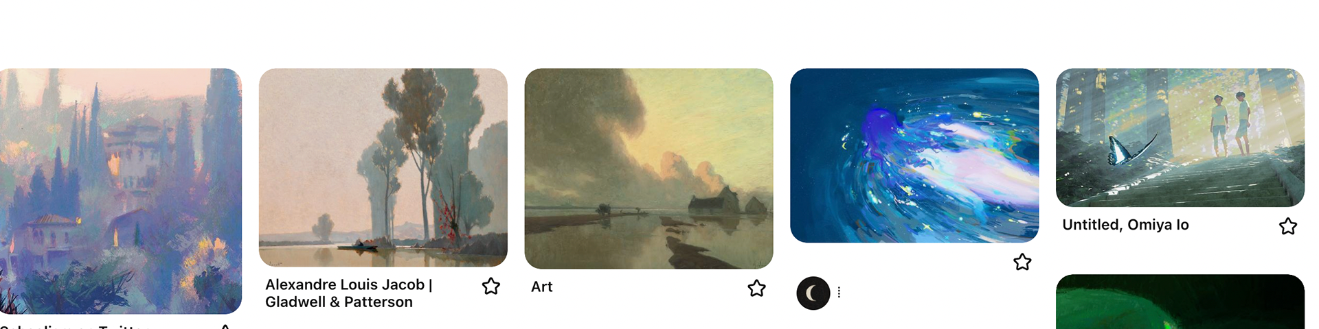
A series of "blue" leaning pieces about childhood and everyday scenes. I felt this specific teal being the dominant color avoided the typical "golden-hued" approach towards nostalgic pieces. Instead, this specific teal felt lively and placed the viewer directly in the piece, in the moment, without the sense of "looking back" that warm colors like orange/gold tended to do when combined with childhood scenes.
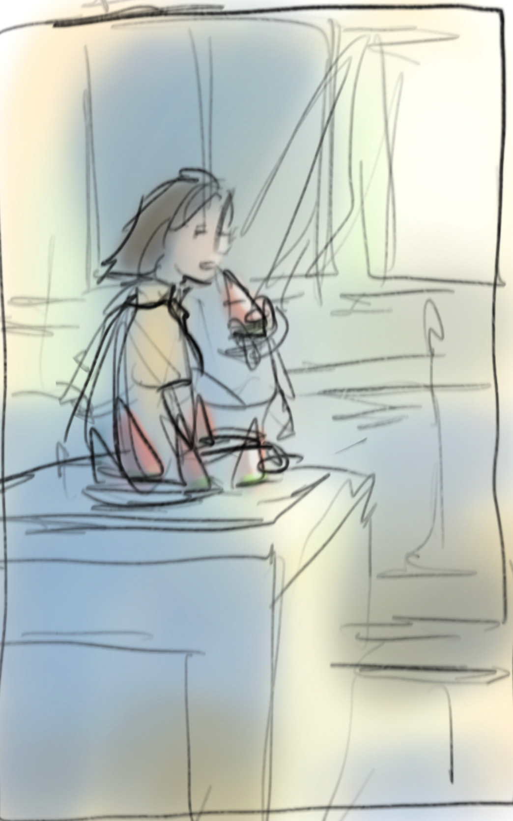

I always start with sketching out thumbnails with the overall color idea. Then, I refine (perspective, details) in a second stage before beginning to paint over. In these stages, I consider composition, value, color, and lighting, and perspective.
Composition - Generally following the rule of thirds by placing the main figure in the top left intersection.
Value/lighting - Strongest value difference at the focal point (black / white) with the rest of the composition generally being darker.
Perspective - I wanted a strong focus on horizontal / vertical lines for a sense of stability.
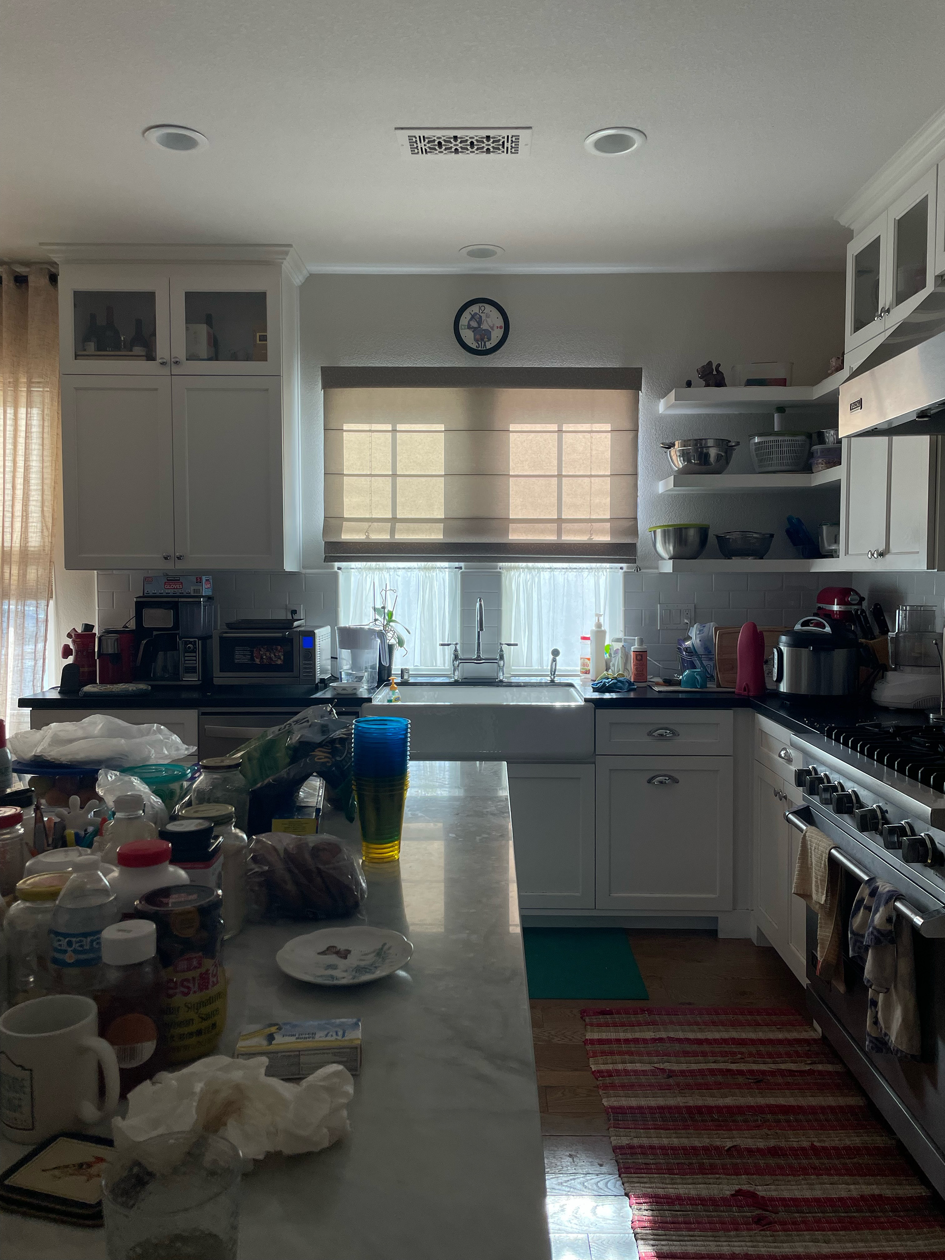
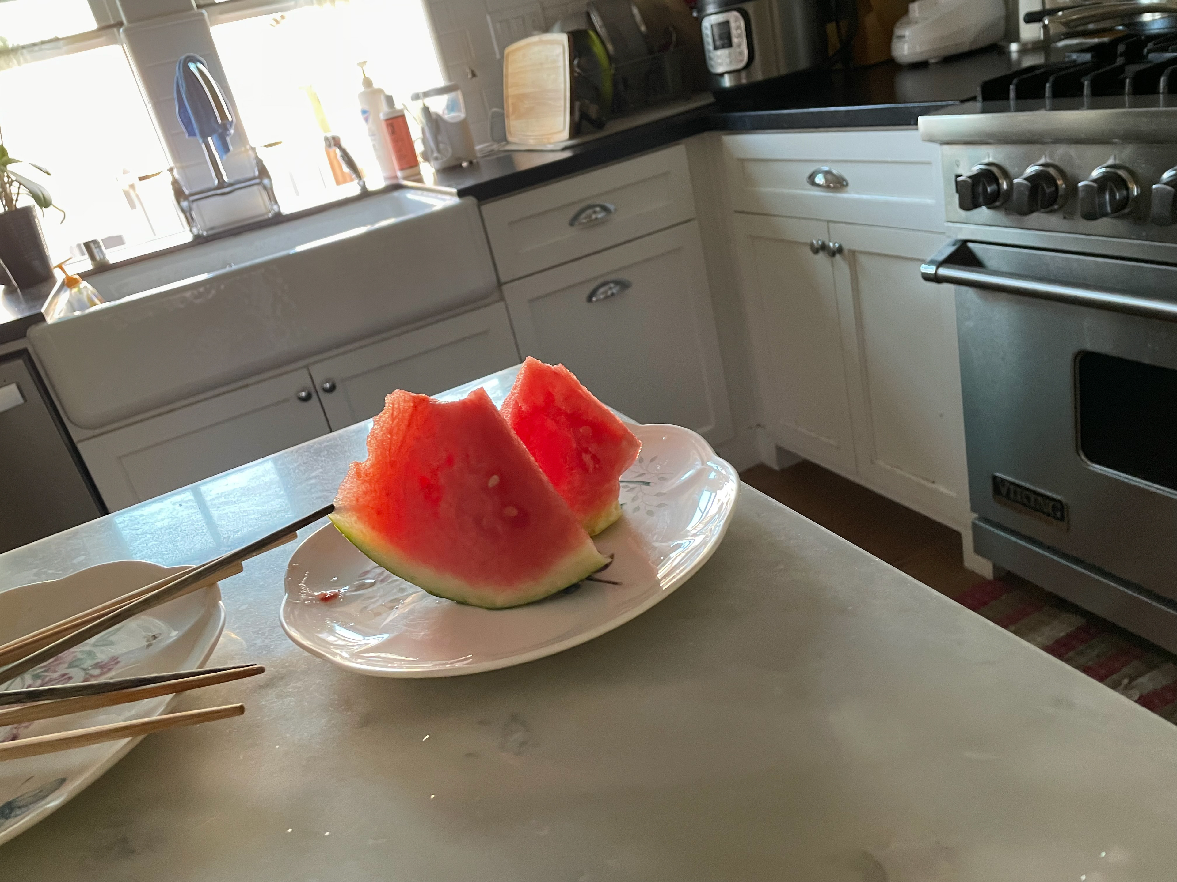
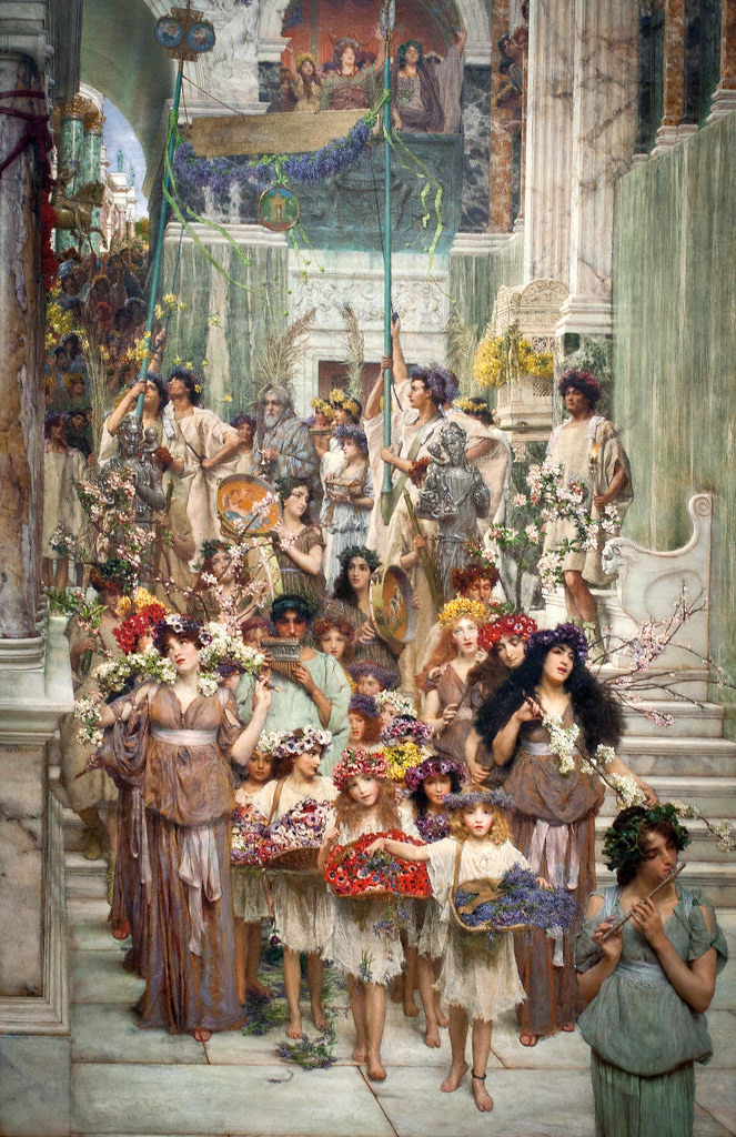
References - Took inspiration from my own kitchen, as well as painters such as Lawrence Alma-Tadema (especially for the marble). I enjoy playing with less saturated colors and subtle changes of hues within greys (ie in some of the pieces pictured below).